100 Days of Lettering: Part 2
Here is the second part of my 100 Days of Lettering challenge. During the last ten days I played with brush pen, drew some doodles and made few calligraphic pieces. I also found two interesting effects discussed below.


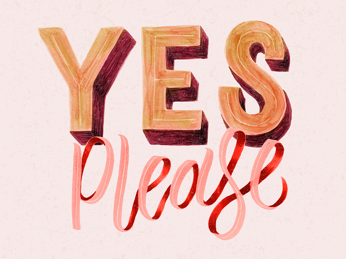
1. Copic markers create textures similar to gouache.
The “Yes Please” piece was made with two green Copic markers (like “Focus” above) and recolored in Photoshop. I found that the textures and shadows that I got from markers are very close to watercolor and gouache.
2. Glossy paper + acrylic paint = vivid brush strokes.
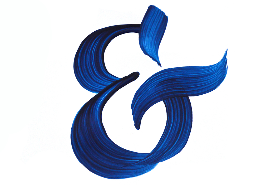
The blue ampersand below was a happy accident. I decided to use the glossy cover from the album pad and try a blue acrylic paint on it. The result amazed me: since the paper was super smooth and bright, all my brush strokes became visible. I didn't expect to get such a vivid look. With a black acrylic paint, the result is usually more muddy. But the blue color allows you to achieve diverse range of shades: from dark to almost transparent. How to get everything in one stroke? Try a glossy paper.