Rocaille Logotype Refinement
Rocaille is a Spanish fashion brand founded by Marí Niko, blending refined craftsmanship, Italian materials, and a playful, expressive aesthetic inspired by 18th-century theatre.
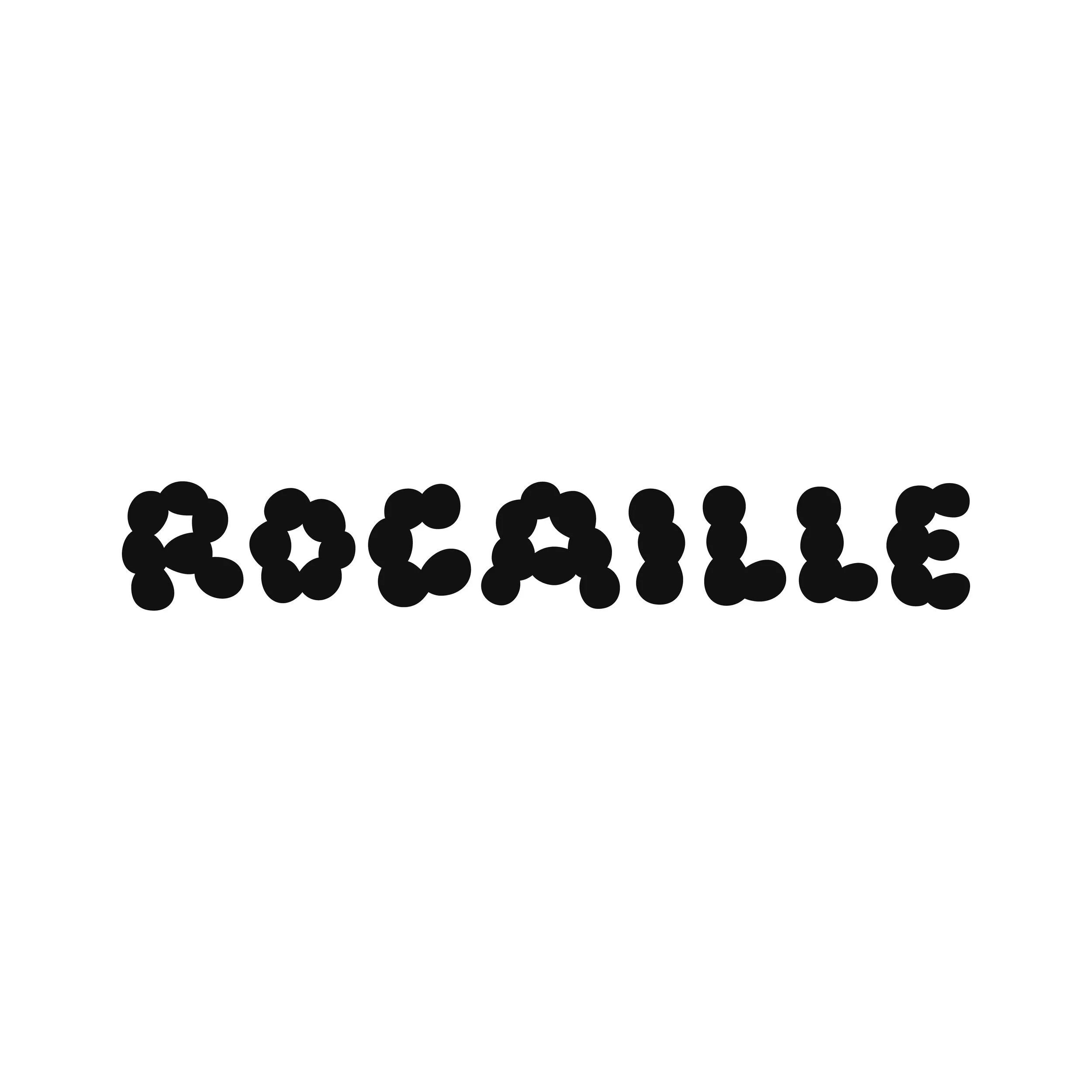
The aim of this project was to refine the existing logotype — improving legibility and balance while preserving the brand’s bold, artistic character.

Approach
The refinement process focused on subtle but meaningful adjustments to the letterforms. Attention was given to counter spaces, repetition, proportions, and overall rhythm, ensuring the logo felt bespoke rather than mechanical.
Key considerations included:Improving legibility at smaller sizes
Reducing visual repetition within the letterforms
Enhancing balance and movement without losing stability

Development

Through a series of sketches and refinements, the logotype evolved toward a more confident and expressive form. Certain elements were softened or sharpened as needed, allowing the mark to feel both structured and lively.
Adjustments to spacing, slant, and counters ensured the logo retained clarity across different scales and applications.

Result
The final logotype reflects Rocaille’s identity — elegant, bold, and expressive — while offering improved versatility for both print and digital use.
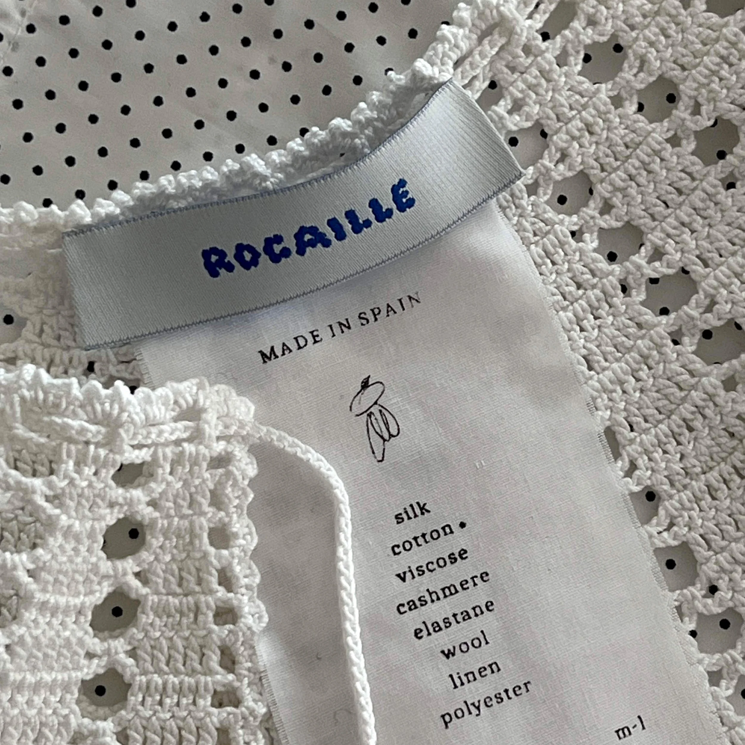
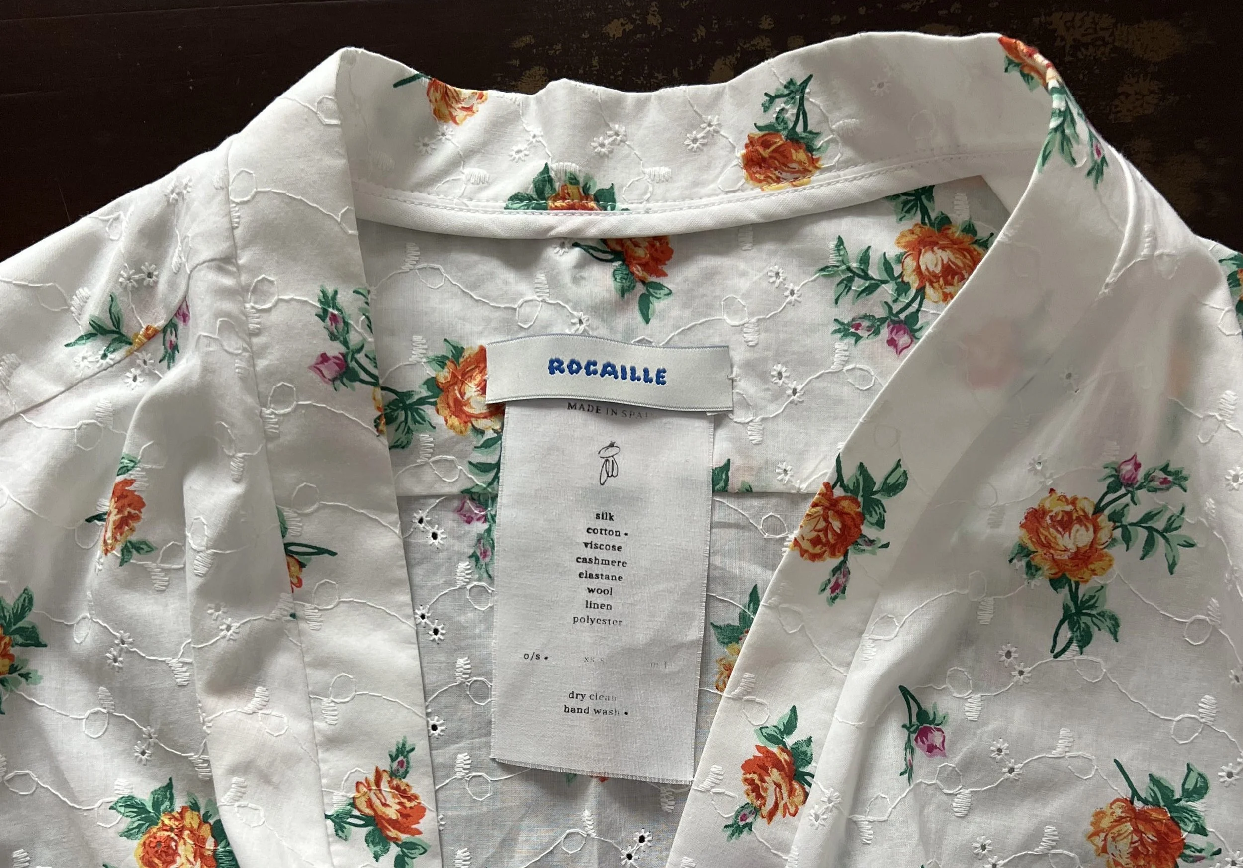
A refined small-scale version was also developed to ensure consistency and legibility across all brand touchpoints.


Photos kindly provided by Marí.
