Client
Marí Niko
rocaille.es
Project
Logo refinement
Rocaille
Rocaille is a Spanish fashion brand founded by Marí Niko, known for its blend of refined craftsmanship, Italian materials, and playful elegance. Inspired by 18th-century theatre and bold, expressive design, Rocaille creates limited collections that balance timeless beauty with a modern, artistic spirit.
I had the pleasure of collaborating with Marí to refine the Rocaille logotype. The goal was to evolve the original logo into a mark that captures the brand’s unique character—elegant yet playful, with a strong artistic presence.
Initial Recommendations
My first suggestions focused on improving legibility and reducing visual repetition, especially in letters that appeared too uniform or mechanical for a bespoke logotype.
Round 1 – First Sketch
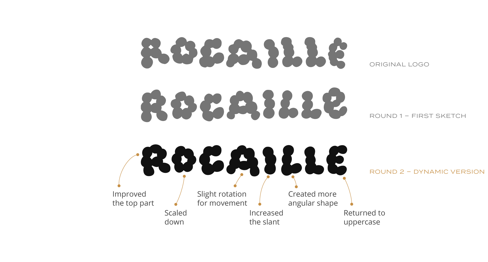
Round 2 – Enhancing Dynamics
We found that the lowercase “e” softened the logo too much, making it feel more suitable for a children’s brand. I returned to the uppercase “E” and explored scaling and rotation for more energy.
Round 3 – A More Stable Version
Final Round – Balancing Stability and Playfulness
Working from the third version, I reintroduced some playfulness by curving the stem of the “R,” enlarging the counters, and improving the horizontal bars in the “E.”
Optimizing for Smaller Sizes
To create a small-scale version of the logotype suitable for reduced sizes, I slightly increased the tracking to prevent the letters from collapsing. I also refined the letter “E” and enlarged the counters in “R,” “O,” and “A” to ensure they remain legible and balanced at smaller sizes.
The final design reflects Rocaille’s style—classic, bold, and expressive. With both large and small-scale versions, the logo is versatile and works well across print and digital formats.
Photos kindly provided by Marí.


