
New in Portfolio: Calligraphy Projects

Over the last few weeks I was working on my portfolio and now I'm glad to share some of my new calligraphy projects. One of the most challenging parts was working with different types of paper. I found that every paper has its own mood, its own particular statement, which should be matched and highlighed with a style of writing. Most of the times it's impossible to write a classic Copperplate on a textured paper, since all letters (and especially thin lines) become too shaky. But the same textured paper might be great for a more relaxed calligraphy style with bouncing letters and a certain level of inconsistency. As a calligrapher I can choose the paper, but the paper will choose the style of my calligraphy. Or at least it will greatly influence my writing. I realized that working with different paper is pushing me out of my comfort zone and towards trying new styles and exploring some more expressive writing. And I'm looking forward to doing so.


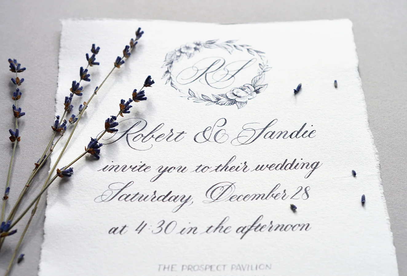
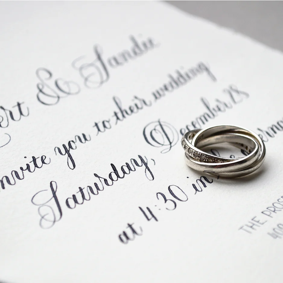
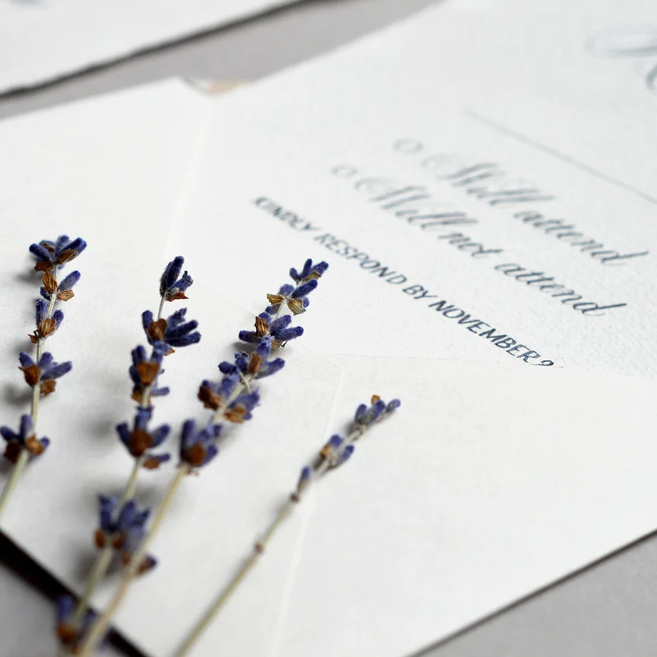
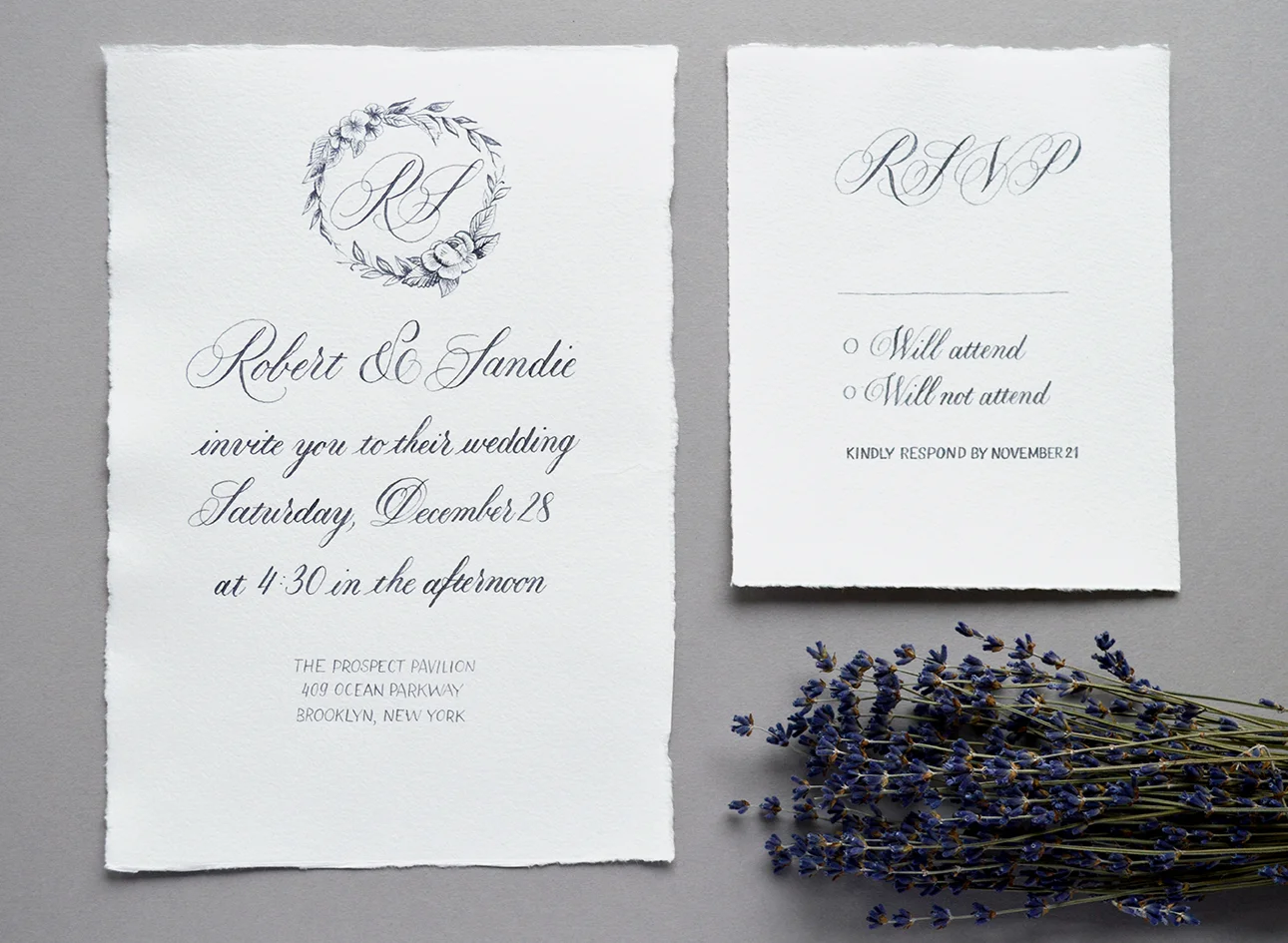
Wedding Collection inspired by Paris in the snow
I’ve been practicing calligraphy for a while, but only recently I decided to take the next step and make it a part of my portfolio. It’s unfair to hold back something that brings me so much joy, and I hope that through my work I can share that joy with you.
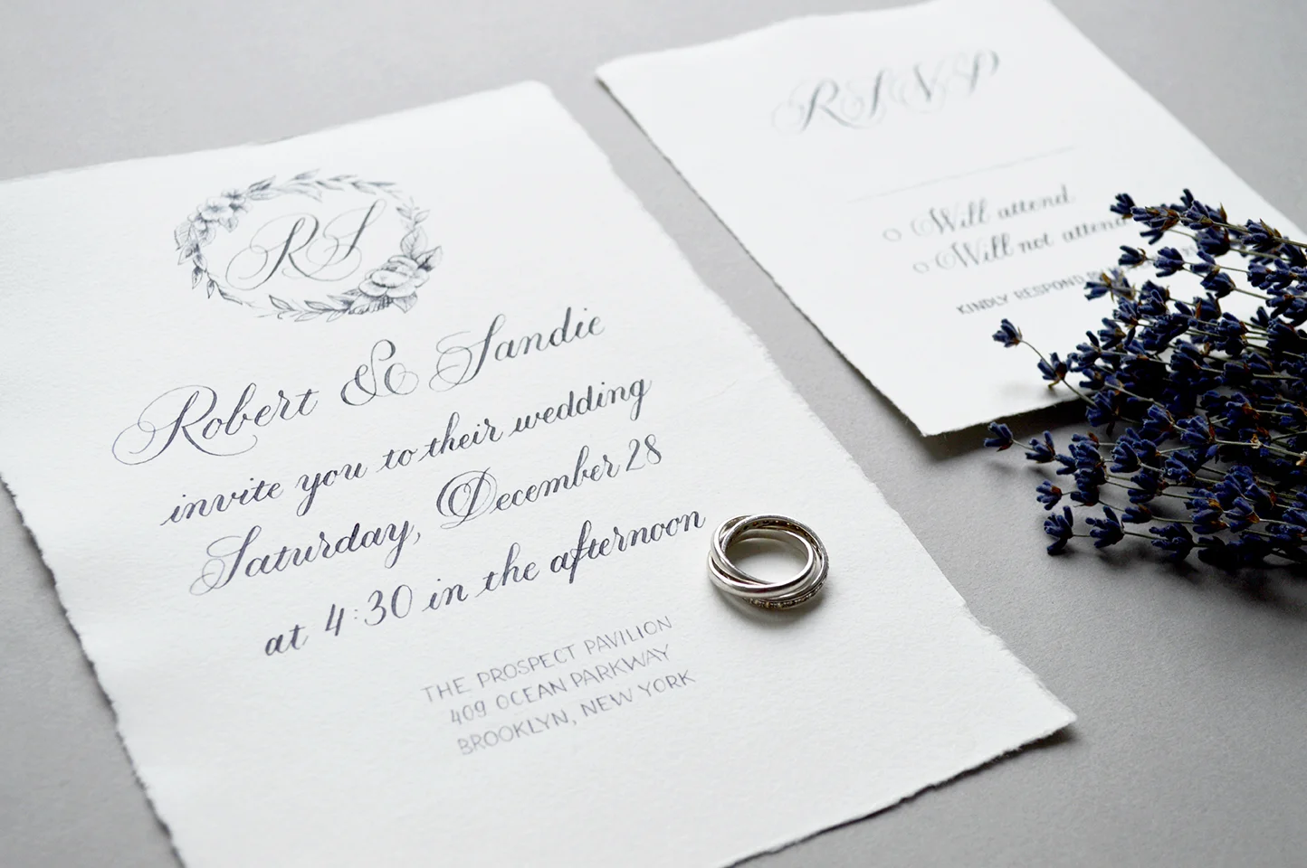
My first wedding collection was inspired by Paris in the snow: minimalistic, classy and with lots of cold grey colors. Why Paris and snow? Since this time I was kinda my own client, I decided to draw inspiration from my own little story. I’ve lived in France for 3 years during my studies and I was obsessed with french culture, traditions, and Paris (of course!) Luckily, I lived quite close to this amazing city and was traveling there often.
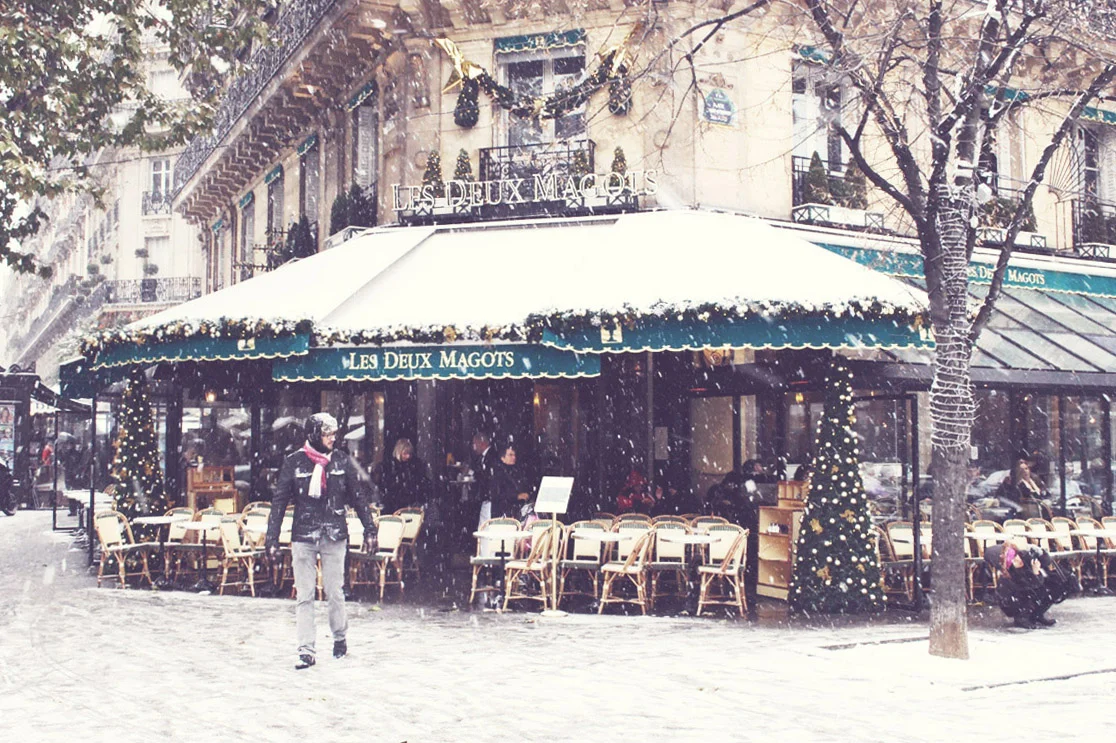
One winter day I was visiting Paris, and suddenly it started to snow. My shoes were not ready for that, and my feet became wet immediately, but who cares? Paris was amazing that day. The entire city was transformed into incredibly beautiful snowy fairy tale. I was walking around and enjoying the moment. After that small adventure I strongly believe that Paris is the best when it snows (I bet right now that french girl from Woody Allen’s “Midnight in Paris” is skeptically shaking her head and saying “Actually, Paris is most beautiful in the rain…”)
Since the snowy weather is not common in Paris, the whole experience became even more special for me. If you still feel too warm, here is my shot from that special day, taken with cold shaking hands:
Now back to calligraphy. To keep my work consistent and within a certain visual frame, I decided to create a mood board that reflects the desired colors and feelings.
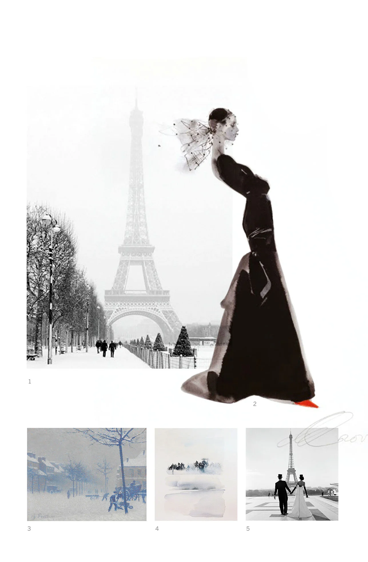
Mood board for the Wedding Collection "Paris in the snow" by Type and Graphics Lab.
Image references: 1. Pinterest, original source unknown. 2. David Downton 3. "Rouen, place Cauchoise sous la neige," Charles Frechon. 4. Yao Cheng. 5. Pinterest, original source unknown.
My mood board was really helpful, and I was constantly referencing it to keep the right feelings and mood in mind. I didn’t include any calligraphy work in my moodboard for one particular reason: it’s extremely easy to get too much inspiration from other calligraphers and unintentionally copy some of their work. Having no particular examples in front of my eyes was the best thing to boost my own creativity.
Sketching ideas was probably the most time consuming phase. But when I determined the whole layout, the implementation was pretty straightforward. Another time consuming task was taking photos. Hopefully, next time I’m going to collaborate with a photographer for a photo shooting (Universe, you’ve heard me!)
That’s all for today, folks. I hope that you liked this work. Stay tuned for more fun things coming up!

100 Days of Lettering: Part 2
Here is the second part of my 100 Days of Lettering challenge. During the last ten days I played with brush pen, drew some doodles and made few calligraphic pieces. I also found two interesting effects discussed below.


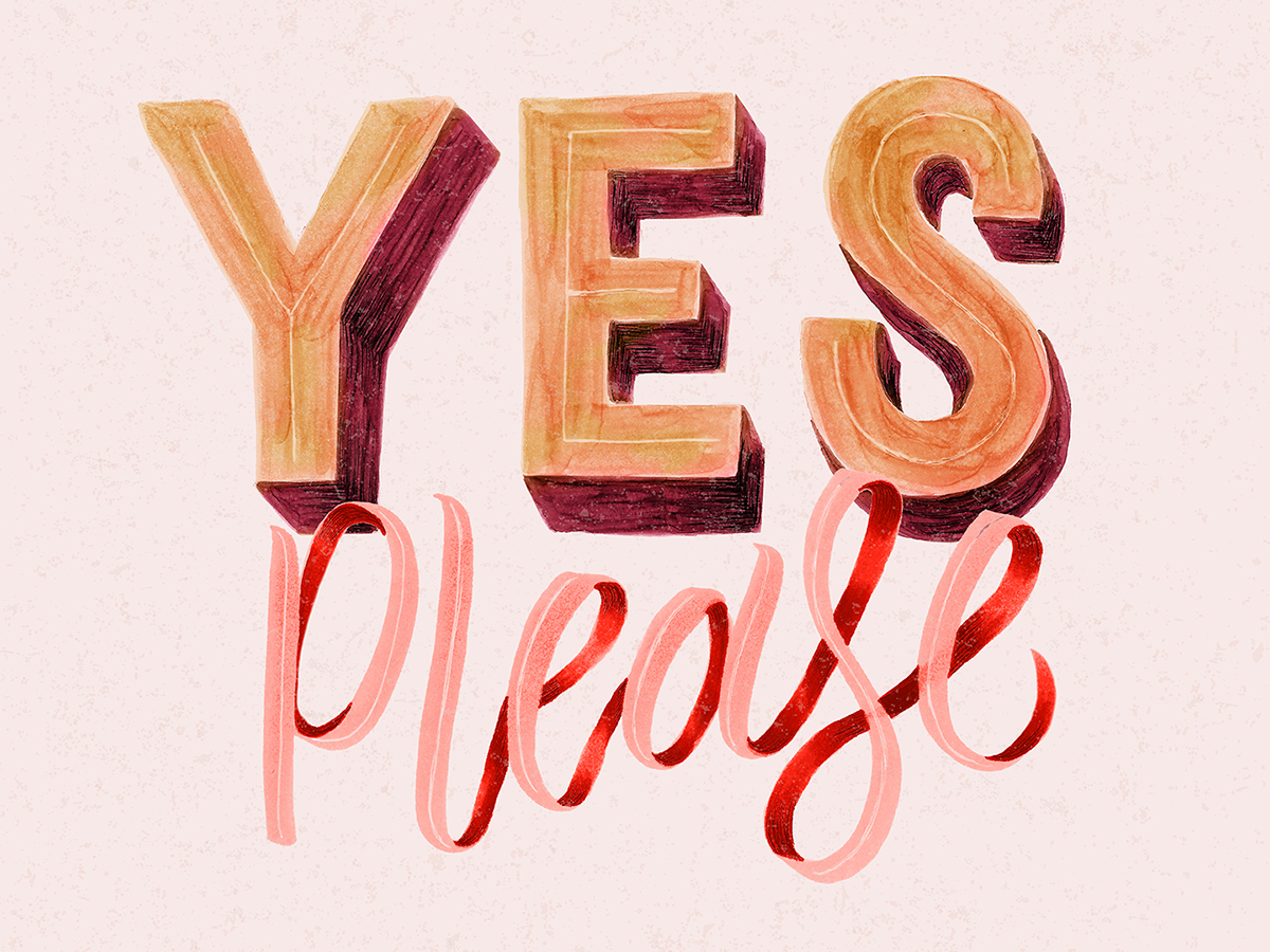
1. Copic markers create textures similar to gouache.
The “Yes Please” piece was made with two green Copic markers (like “Focus” above) and recolored in Photoshop. I found that the textures and shadows that I got from markers are very close to watercolor and gouache.
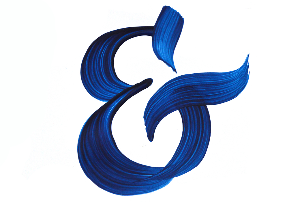
2. Glossy paper + acrylic paint = vivid brush strokes.
The blue ampersand below was a happy accident. I decided to use the glossy cover from the album pad and try a blue acrylic paint on it. The result amazed me: since the paper was super smooth and bright, all my brush strokes became visible. I didn't expect to get such a vivid look. With a black acrylic paint, the result is usually more muddy. But the blue color allows you to achieve diverse range of shades: from dark to almost transparent. How to get everything in one stroke? Try a glossy paper.

Learning Calligraphy
A year ago I took a calligraphy class on Skillshare just for fun. The results amazed me. I thought that my writing was increadibly cool. Look at that – what a wonderful tiny swirl! What a graceful swash!

The class was quite relaxed, more like a general introduction to calligraphy. I thought that I was doing really great and should keep on going. The ignorance about my real level of skill saved my passion. I continued practicing calligraphy from time to time. The results improved slowly, but it did not bother me. I enjoyed the process. After 8 months of tranquil play I decided to take my practice to a new level. I bought a book “Mastering Copperplate* Calligraphy: A Step-by-Step Manual” by Eleanor Winters. At that point the sweat and tears began. Two more months later I saw the results of a step-by-step approach. My letters improved and lines became more controlled. But at the same time I realized how far away my writing was from the real copperplate calligraphy. It was a quite disappointing revelation.
The main problem was that I expected quick results, although mastering calligraphy requires time. This idea of long-term practice is not a discovery for me though. I went to a music school when I was a kid and I know that learning to play piano takes time and efforts. It's impossible to start playing in one day. The regular practice is required to see results and a true music comes after long hours of practicing scales. It's the same for calligraphy and many other similar activities. For some reason the comparison with music calmed my mind. My current level became just a step towards a true “music” in calligraphy.

Recommended resources:
- “Mastering Copperplate Calligraphy: A Step-by-Step Manual” by Eleanor Winters
- “Modern Calligraphy” by Molly Suber Thorpe
- Skillshare class “Digitizing Calligraphy: From Sketch to Vector” by Molly Suber Thorpe