100 Days of Lettering
Yesterday I decided to start a lettering project and keep it for 100 days. I'm going to draw some phrases and words using different media, experiment with color, layout and just play with my favorite brush pen. I will post my work update once in ten days.
The main theme of the whole project.
Although the whole idea of doing such a long term project seemed very optimistic to me, today I feel overwhelmed by the amount of work waiting for me. For the moment I have about thirty phrases to draw, and I suppose that finding the rest will be really challenging. Feel free to suggest something, any ideas are welcome!
Cheering up myself :)
New in Portfolio
I was quite happy with a recent brushpen experiment, so that I put this piece in my Lettering portfolio.
Behind the Scenes of a Lettering Project
My process from the first sketches to the final vector work.
The phrase “Today is Always the Best Day” materialized when I was looking for inspirational quotes for my lettering project. Phrases like “Make Today Awesome” or “Today is the Day” were good and inspiring, but for some reason they did not resonate with me strong enough. These quotes have too much action, while sometimes the hardest part is staying still and appreciate the moment. We all think too much about the future or the past. We are waiting for something or digging through the memories, although our best moment is now. And the best day is today. Always.
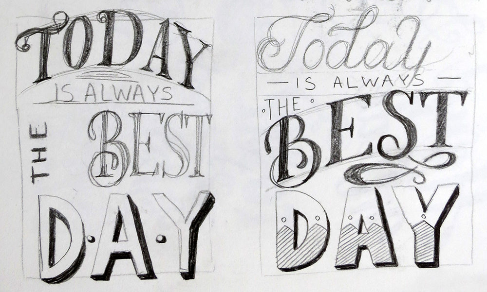
Below I show my process from the first sketches to the final vector work.
I tried several calligraphic and brush pen variations.
Finally, I decided to keep the layout of the hand drawn version and tried to play with color while tweaking small details.
Over the time this phrase became a part of my philosophy, so I decided to set it in stone and create a clean vector version.
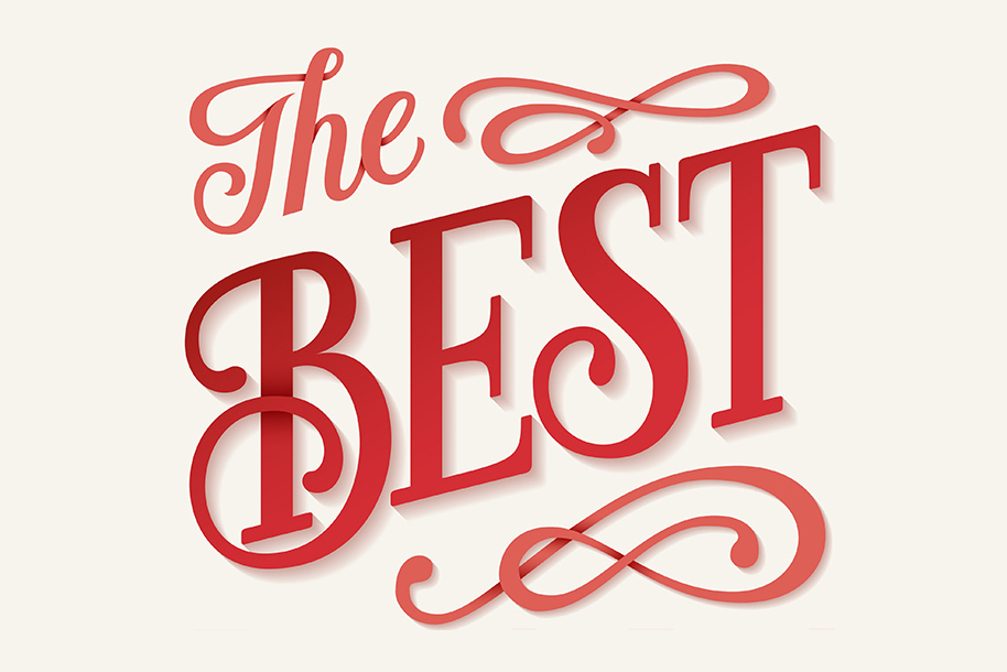
After adding gradients and shadows, here is my final result.
Alphabet Exploration
I started Alphabet Exploration eight months ago to learn the various ways to construct letterforms. I was looking at existing typefaces on my computer as well as gathering inspiration from letterers, type designers and type foundries. Everything was drawn by hand and without preliminary sketches. Most of the time I worked with distinctive display or script fonts (Bauhaus 93, Lobster, Rockwell and others), since these are easier to draw. My project resulted in a quickly accessible collection of alphabets depicted in various styles. I find useful to look through it from time to time for finding the inspiration.


