
Spencerian Workshop with Michael Sull + Penmanship Specimens
Last December I was lucky enough to attend a four-day Spencerian workshop with Michael Sull in Saint-Petersburg. Michael is a great Master Penman, author of several books and a wonderful teacher. It was such an invaluable experience for me to watch Michael's demonstrations and his writing process. Moreover, Michael brought some old calligraphy specimens and let students take pictures of them. With his kind permission, I'm happy to share with you some of the fascinating examples of penmanship.

Calligraphy by Michael Sull
Last December I was lucky enough to attend a four-day Spencerian workshop with Michael Sull in Saint-Petersburg. Michael is a great Master Penman, author of several books and a wonderful teacher. It was such an invaluable experience for me to watch Michael's demonstrations and his writing process. Moreover, Michael brought some old calligraphy specimens and let students take pictures of them. With his kind permission, I'm happy to share with you some of the fascinating examples of penmanship.
Drills


Envelopes and Correspondence


Letterforms


Signatures


Featured in IdN Magazine
I am so excited and honored to be featured in IdN Magazine v23n6: Illustration in Pattern Making!

Pattern is one of the most under-rated — and therefore often unfairly disregarded — genres of design. All you have to do, surely, is come up with a few elements that in terms of colour, shape, form and size combine well together, and then repeat them ad infinitum, no? This is a common misapprehension of the uninitiated. The truth is that pattern-creation can be as simple or as complex as you choose to make it. And it is something that almost every designer has had recourse to during their career. (From IdN Magazine)


One Paper. Two Wedding Collections
It all happened about a month ago: I found a strange dark emerald paper in a small stationary shop. I just was not able to go back home without a piece of it.
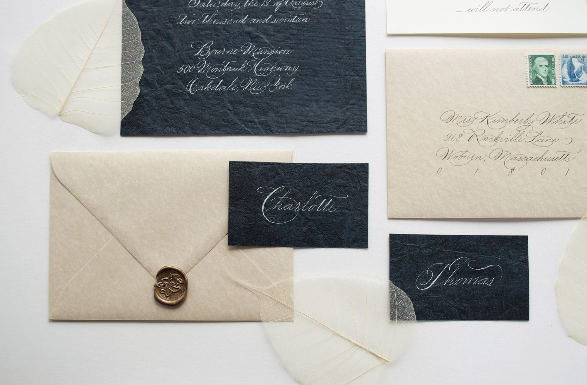
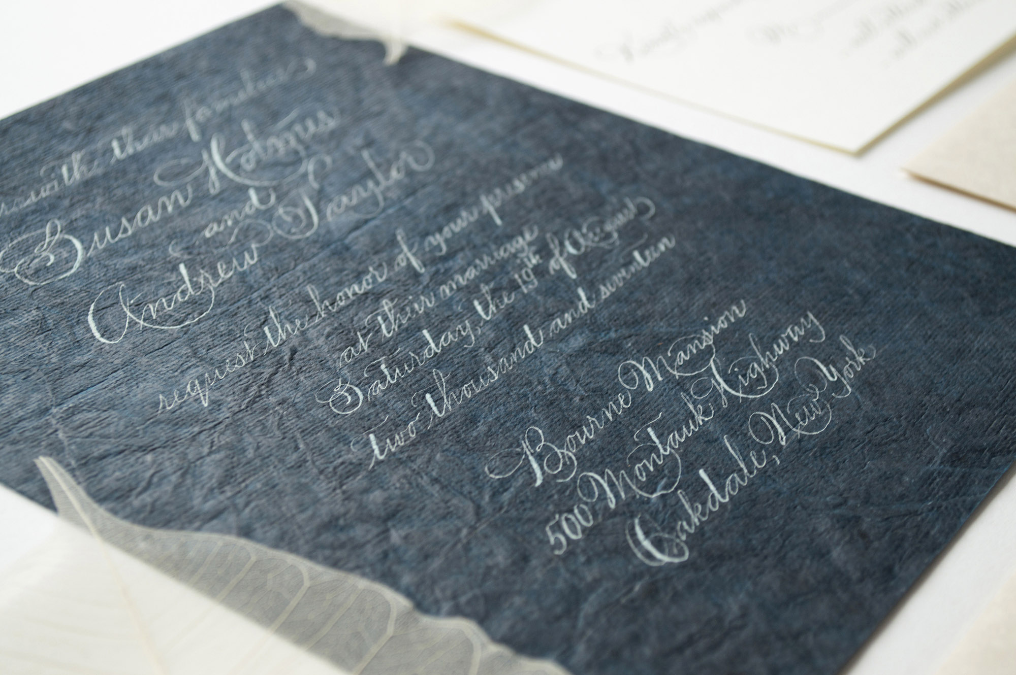
It all happened about a month ago: I found a strange dark emerald paper in a small stationary shop. I just was not able to go back home without a piece of it. Fascinated by the color and the texture, I suppressed my doubts about how I could actually write on such a textured surface. Somehow I'd figure it out later… Well, what I found is that this paper was not suitable for writing: it doesn’t hold the ink. I’ve spent many hours in attempts to find the perfect mixture, only to realize that nothing works and I have only half of that precious material left. Then I made my last attempt and wiped it with a wet dishcloth. And it did the trick! After this little cleaning procedure, I was finally able to write on this paper (it was still quite challenging due to the textured surface). Anyway, I’ve made a whole wedding invitation suite inspired by the Spencerian Script. Then I decided to create another one with a more expressive freestyle writing to match the whimsical character of the paper. Usually, I prefer not to go so wild with my calligraphy, but this time I just allowed myself to forget about the rules and find the flow. The end result may be quite hard to read. Still, it’s always worth trying!


Patterns on Products: The Swimwear by The Call of Summer
As a pattern designer, I am always thrilled to see how my work is going to look on real life products. I am even more excited when it resonates with the brand’s voice. Recently I received some styled shoots from The Call of Summer, an online brand making gorgeous swimwear for women.

As a pattern designer, I am always thrilled to see how my work is going to look on real life products. I am even more excited when it resonates with the brand’s voice. Recently I received some styled shoots from The Call of Summer, an online brand making gorgeous swimwear for women. I am so on board with their belief that the true beauty is all about being authentic and imperfect. When I design patterns, my hands get dirty, and the floor around my table is covered with dozens of pieces of paper. My design process is definitely imperfect. Would I create the same stuff if I strived to keep everything nice and clean? I don’t think so. Would I find some nice pattern ideas while being afraid of ink splashes on my table? Probably not. Imperfections are a part of our lives, that’s what makes us unique. I hope that my messy pattern supports and reinforces the idea of being authentic and embracing your personality. If you want to learn more about The Call of Summer, check out their website or Instagram page. And don't forget to play more & worry less!
All photos were kindly provided by The Call of Summer.


100 Days of Lettering: Part 10
The last part of the lettering challenge. Finally!

I can’t believe that today is the last day of my lettering project. In the middle of the challenge I had an impression that it would never end. Looking back now I realize that it was actually very fast and even not enough to find my favorite style, technique or media. Drawing letters for 3+ months is almost nothing if you think about your whole life. It’s like a tiny little step towards new adventures and discoveries. The good thing is that the end of the project is not the end at all, but rather a beginning. I will try to maintain my habit of drawing letters every day and post new projects as often as possible. Now I'm going to make myself a cup of coffee and enjoy the moment of glory ;)
Thanks for watching!


Other parts:


The Small Caps Issue
We’ve all seen beautiful small caps in those nicely designed books. And we’ve all tried at least once to use small caps in our own designs. But for some reason all those attempts looked weird: our small caps were ugly. So why can’t we achieve the same results? What’s the problem with our small caps?
A quick intro: small caps are the uppercase (capital) letters that have similar or the same height as the lowercase letters. They are used in headings and body text to emphasize abbreviations, acronyms or definitions.

There are actually two types of small caps: the real (you see in books) and the fake ones (you are likely working with). The real small caps are designed by type designers to match the stroke thickness of other characters. The fake ones are generated automatically by scaling down the capital letters. As the result, fake small caps don’t have the same stroke thickness.

This scaling trick creates an inconsistent text color: the uppercase letters appear bolder and darker in comparison with the fake small caps. In example below the first headline has thicker capital W, T and M, while the second headline looks consistent.

In a paragraph fake small caps appear like visual gaps, since they are much lighter than the surrounding text.

Now the bad news. In MS Office you always get the fake small caps even if the font contains the real small caps. That's the way MS Office works with small caps: it will always scale down capital letters. Sometimes you can find a font that has small caps as a separate file (usually such fonts have an SC abbreviation in their name). In this case you can work with small caps as with any other font.

Unfortunately, neither Mac OS nor Windows has system fonts with a separate small caps file. This means you will never work with real small caps in MS Office if you only use the preinstalled fonts. Never ever in your life you will create those beautiful small caps. The easiest solution to this problem is to abandon small caps altogether (in most cases you don’t really need them). There are many other ways to highlight text without sacrificing good typography. But if small caps are absolutely required for your project, I recommend to check out a free font Alegreya (both serif and sans serif versions). This font has small caps as a separate file, so it can be used in Microsoft Office.


If you work with Adobe software, the situation is a little bit better. You can use real small caps that come with certain fonts. Although be careful: if the chosen font doesn’t have real small caps in the main file, you will get the fake ones generated the same way as in MS Office. It is safe to use the following fonts in Adobe software, since they have the real small caps:


Two free fonts to consider:


If you have MS Office installed, keep an eye on Calibri and Palatino Linotype. Even though MS Office itself doesn’t allow to use the real small caps, you can access them through Adobe software.


My general advice: never use fake small caps. If you are not sure which small caps you get in a particular font, just don’t use them.
Additional reading:
• Book chapter by Mathew Butterick on practicaltypography.com
• Article by Ilene Strizver on fonts.com
• Book chapter by Ellen Lupton on thinkingwithtype.com

Behind the Scenes of a Lettering Project
My process from the first sketches to the final vector work.

The phrase “Today is Always the Best Day” materialized when I was looking for inspirational quotes for my lettering project. Phrases like “Make Today Awesome” or “Today is the Day” were good and inspiring, but for some reason they did not resonate with me strong enough. These quotes have too much action, while sometimes the hardest part is staying still and appreciate the moment. We all think too much about the future or the past. We are waiting for something or digging through the memories, although our best moment is now. And the best day is today. Always.
Below I show my process from the first sketches to the final vector work.
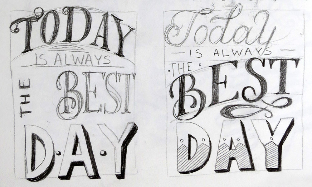


I tried several calligraphic and brush pen variations.


Finally, I decided to keep the layout of the hand drawn version and tried to play with color while tweaking small details.


Over the time this phrase became a part of my philosophy, so I decided to set it in stone and create a clean vector version.


After adding gradients and shadows, here is my final result.
