Abstract Design Toolbox
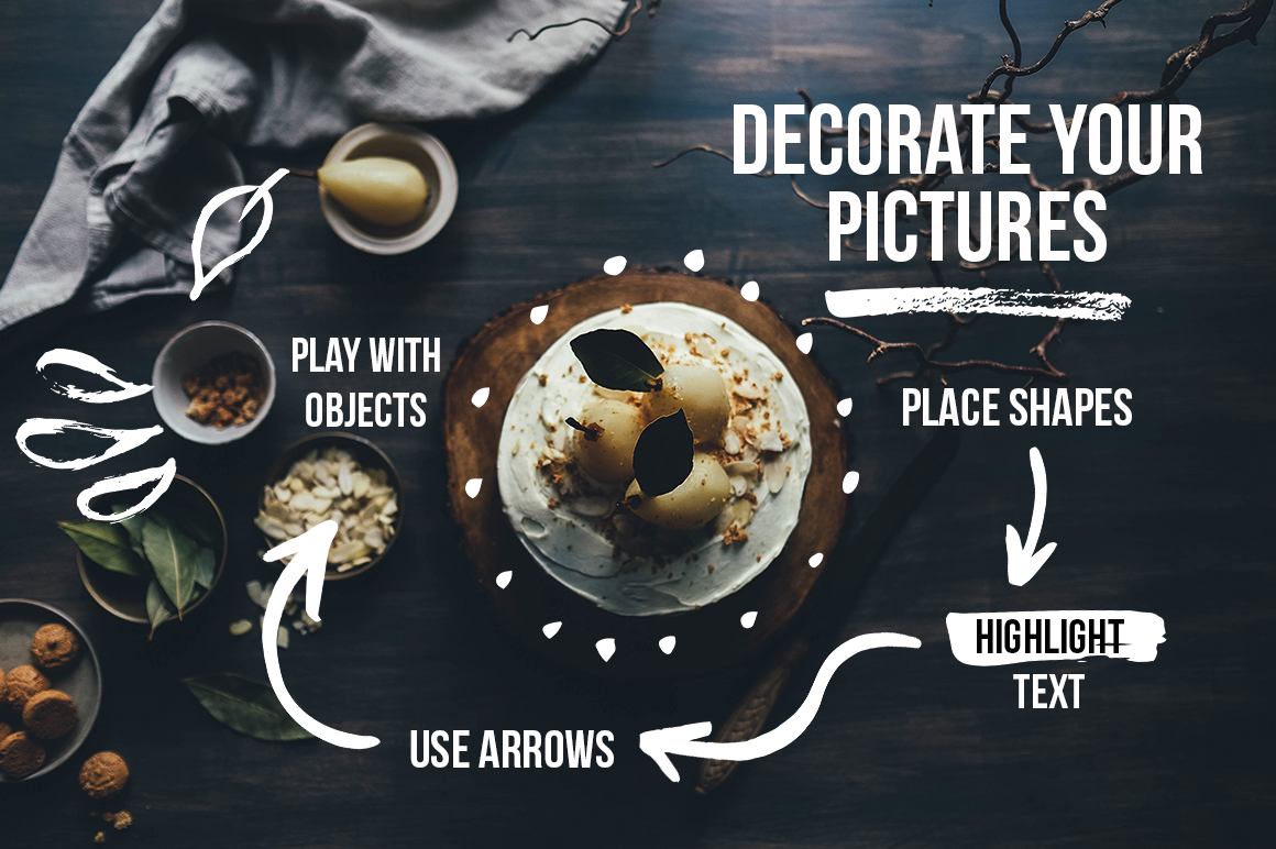
Recently I released a decorative collection that contains 250 hand crafted design elements: geometric shapes, arrows, speech bubbles, lines, splotches, etc. They have a textured look and are great to create logos, decorate your print or web designs, and add a hand drawn touch here and there.
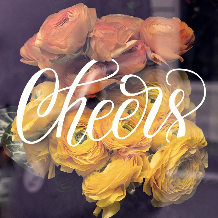
Here are few pictures of what you can do with these elements:
All photos are from Unsplash
Would you like to test this collection? Grab the following elements for free:
100 Days of Lettering: Part 1
Here is my project update for the last week (days 3–10). I am cheating a little bit, since I don't show up on Instagram daily, but I am showing up to practice and experiment. Uploading work online takes a lot of time that can be spent working. So I hope that you forgive me for being inconsistent with my online presence. The blog posts will arrive every ten days though, as it was planned.
100 Days of Lettering
Yesterday I decided to start a lettering project and keep it for 100 days. I'm going to draw some phrases and words using different media, experiment with color, layout and just play with my favorite brush pen. I will post my work update once in ten days.
The main theme of the whole project.
Although the whole idea of doing such a long term project seemed very optimistic to me, today I feel overwhelmed by the amount of work waiting for me. For the moment I have about thirty phrases to draw, and I suppose that finding the rest will be really challenging. Feel free to suggest something, any ideas are welcome!
Cheering up myself :)
The Small Caps Issue
We’ve all seen beautiful small caps in those nicely designed books. And we’ve all tried at least once to use small caps in our own designs. But for some reason all those attempts looked weird: our small caps were ugly. So why can’t we achieve the same results? What’s the problem with our small caps?
A quick intro: small caps are the uppercase (capital) letters that have similar or the same height as the lowercase letters. They are used in headings and body text to emphasize abbreviations, acronyms or definitions.
There are actually two types of small caps: the real (you see in books) and the fake ones (you are likely working with). The real small caps are designed by type designers to match the stroke thickness of other characters. The fake ones are generated automatically by scaling down the capital letters. As the result, fake small caps don’t have the same stroke thickness.
This scaling trick creates an inconsistent text color: the uppercase letters appear bolder and darker in comparison with the fake small caps. In example below the first headline has thicker capital W, T and M, while the second headline looks consistent.
In a paragraph fake small caps appear like visual gaps, since they are much lighter than the surrounding text.
Now the bad news. In MS Office you always get the fake small caps even if the font contains the real small caps. That's the way MS Office works with small caps: it will always scale down capital letters. Sometimes you can find a font that has small caps as a separate file (usually such fonts have an SC abbreviation in their name). In this case you can work with small caps as with any other font.
Unfortunately, neither Mac OS nor Windows has system fonts with a separate small caps file. This means you will never work with real small caps in MS Office if you only use the preinstalled fonts. Never ever in your life you will create those beautiful small caps. The easiest solution to this problem is to abandon small caps altogether (in most cases you don’t really need them). There are many other ways to highlight text without sacrificing good typography. But if small caps are absolutely required for your project, I recommend to check out a free font Alegreya (both serif and sans serif versions). This font has small caps as a separate file, so it can be used in Microsoft Office.
If you work with Adobe software, the situation is a little bit better. You can use real small caps that come with certain fonts. Although be careful: if the chosen font doesn’t have real small caps in the main file, you will get the fake ones generated the same way as in MS Office. It is safe to use the following fonts in Adobe software, since they have the real small caps:
Two free fonts to consider:
If you have MS Office installed, keep an eye on Calibri and Palatino Linotype. Even though MS Office itself doesn’t allow to use the real small caps, you can access them through Adobe software.
My general advice: never use fake small caps. If you are not sure which small caps you get in a particular font, just don’t use them.
Additional reading:
• Book chapter by Mathew Butterick on practicaltypography.com
• Article by Ilene Strizver on fonts.com
• Book chapter by Ellen Lupton on thinkingwithtype.com
50 Messy Patterns
Today I gathered fifty of my recent patterns and made a “messy” bundle. I tried to keep as much texture as possible to preserve that natural hand made look. All of these patterns are available in vector format. I also provide JPG versions and PNG files with transparent background.
It's always fun to create mockups and see my patterns on real products. Well, it's both fun and dangerous, because now I want those fancy glasses.
New in Portfolio
I was quite happy with a recent brushpen experiment, so that I put this piece in my Lettering portfolio.
Behind the Scenes of a Lettering Project
My process from the first sketches to the final vector work.
The phrase “Today is Always the Best Day” materialized when I was looking for inspirational quotes for my lettering project. Phrases like “Make Today Awesome” or “Today is the Day” were good and inspiring, but for some reason they did not resonate with me strong enough. These quotes have too much action, while sometimes the hardest part is staying still and appreciate the moment. We all think too much about the future or the past. We are waiting for something or digging through the memories, although our best moment is now. And the best day is today. Always.
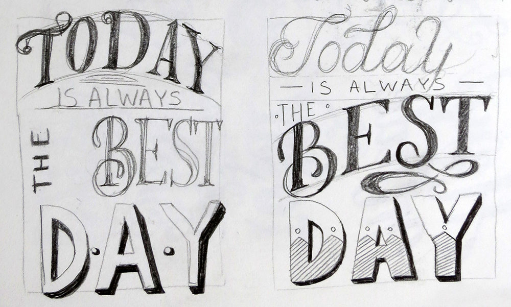
Below I show my process from the first sketches to the final vector work.
I tried several calligraphic and brush pen variations.
Finally, I decided to keep the layout of the hand drawn version and tried to play with color while tweaking small details.
Over the time this phrase became a part of my philosophy, so I decided to set it in stone and create a clean vector version.
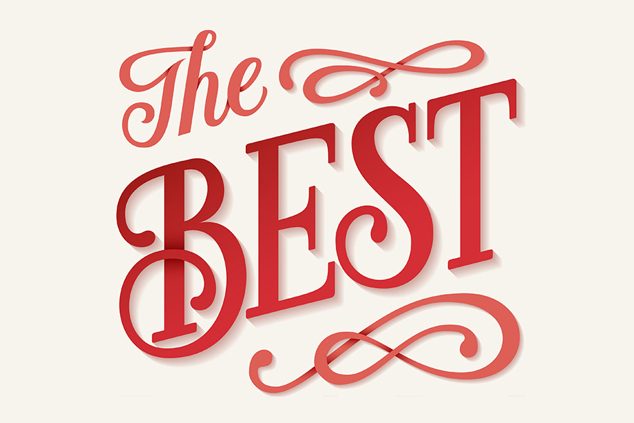
After adding gradients and shadows, here is my final result.


