
Featured in IdN Magazine
I am so excited and honored to be featured in IdN Magazine v23n6: Illustration in Pattern Making!

Pattern is one of the most under-rated — and therefore often unfairly disregarded — genres of design. All you have to do, surely, is come up with a few elements that in terms of colour, shape, form and size combine well together, and then repeat them ad infinitum, no? This is a common misapprehension of the uninitiated. The truth is that pattern-creation can be as simple or as complex as you choose to make it. And it is something that almost every designer has had recourse to during their career. (From IdN Magazine)


New in Portfolio: Calligraphy over Photos

“Unless you try to do something beyond what you have already mastered, you will never grow.” Ralph Waldo Emerson
Calligraphy by Type and Graphics Lab typeandgraphicslab.com | Photo by Averie Woodard | Source unsplash.com
For the last couple of weeks, I've been interested in writing calligraphy over photos and creating some kind of background texture with letters. A quote by Ralph Waldo Emerson was an experiment in modern calligraphy with bouncing expressive letters. The next one was a little phrase from a wedding vow, which I wrote in a more traditional way. And the last quote about ballet by Peter Martins was even more experimental (and challenging!) since I tried to incorporate a lot of flamboyant decorative elements. Looking at these three pieces together, I realized that in terms of letterforms I prefer more traditional styles of calligraphy not only for legibility reasons, but also for their timeless elegance.

“To have and to hold, to love and to cherish”
Calligraphy by Type and Graphics Lab typeandgraphicslab.com | Photo by Chiến Phạm | Source: unsplash.com

“Ballet is pure and demands that you serve something larger than yourself, whether it be beauty or art, or a combination of both. It requires discipline, taking care of yourself, taking care of your own body first. Then it allows you to give of that beauty, the beauty that you acquire by sculpting your own body all your life.” Peter Martins
Calligraphy by Type and Graphics Lab typeandgraphicslab.com | Photo by Ron Sartini | Source: unsplash.com


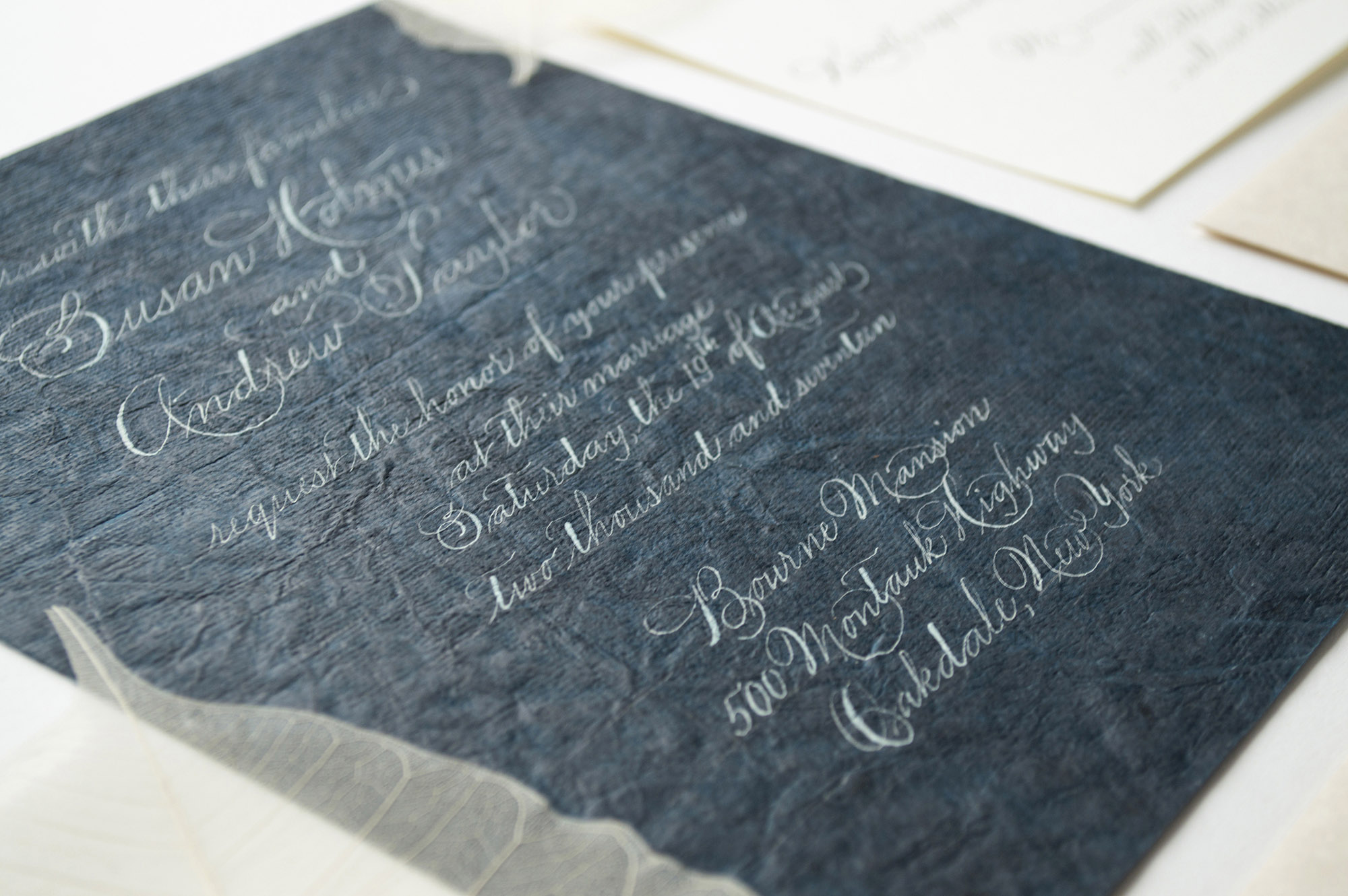
One Paper. Two Wedding Collections
It all happened about a month ago: I found a strange dark emerald paper in a small stationary shop. I just was not able to go back home without a piece of it.
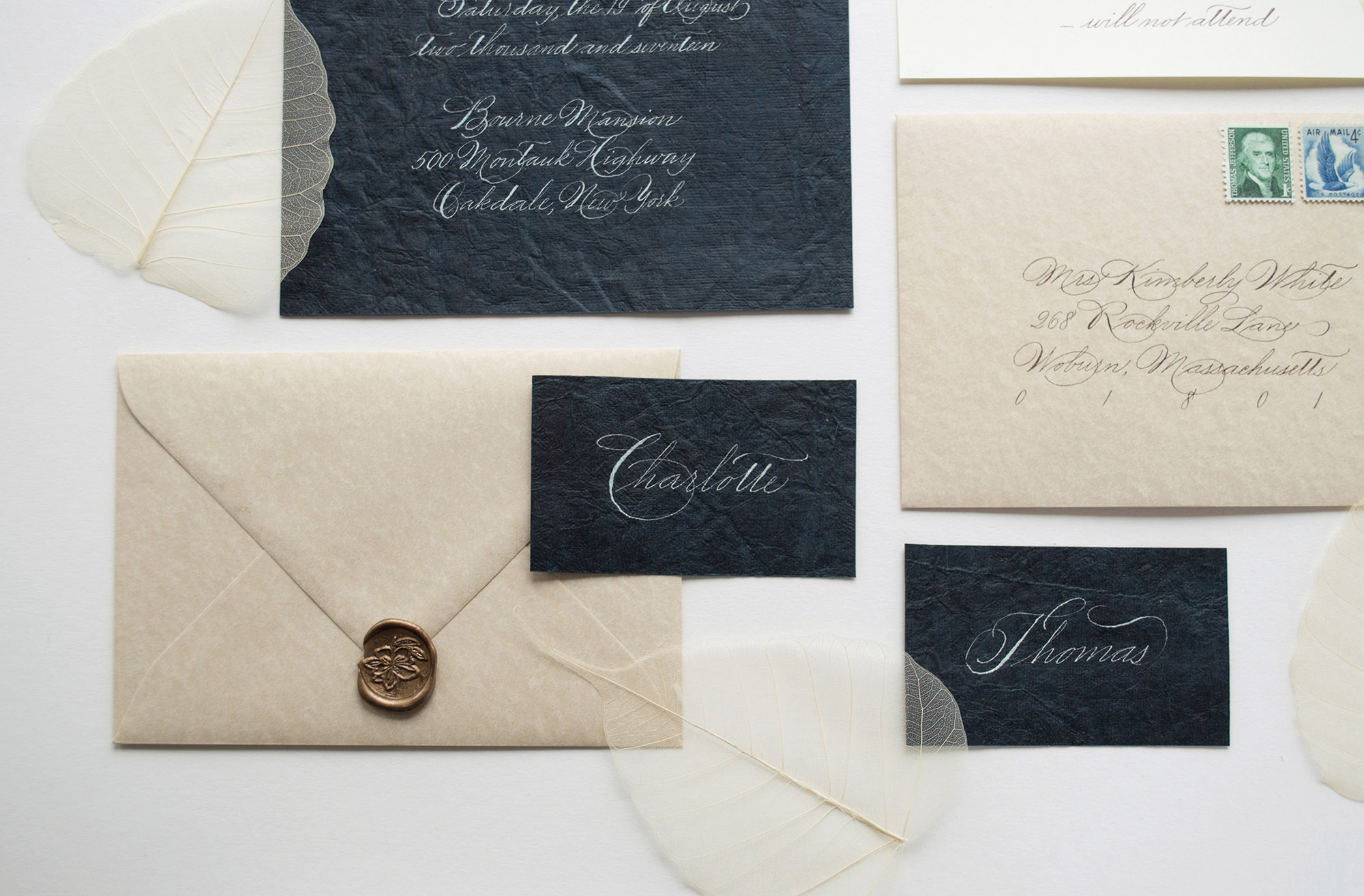
It all happened about a month ago: I found a strange dark emerald paper in a small stationary shop. I just was not able to go back home without a piece of it. Fascinated by the color and the texture, I suppressed my doubts about how I could actually write on such a textured surface. Somehow I'd figure it out later… Well, what I found is that this paper was not suitable for writing: it doesn’t hold the ink. I’ve spent many hours in attempts to find the perfect mixture, only to realize that nothing works and I have only half of that precious material left. Then I made my last attempt and wiped it with a wet dishcloth. And it did the trick! After this little cleaning procedure, I was finally able to write on this paper (it was still quite challenging due to the textured surface). Anyway, I’ve made a whole wedding invitation suite inspired by the Spencerian Script. Then I decided to create another one with a more expressive freestyle writing to match the whimsical character of the paper. Usually, I prefer not to go so wild with my calligraphy, but this time I just allowed myself to forget about the rules and find the flow. The end result may be quite hard to read. Still, it’s always worth trying!


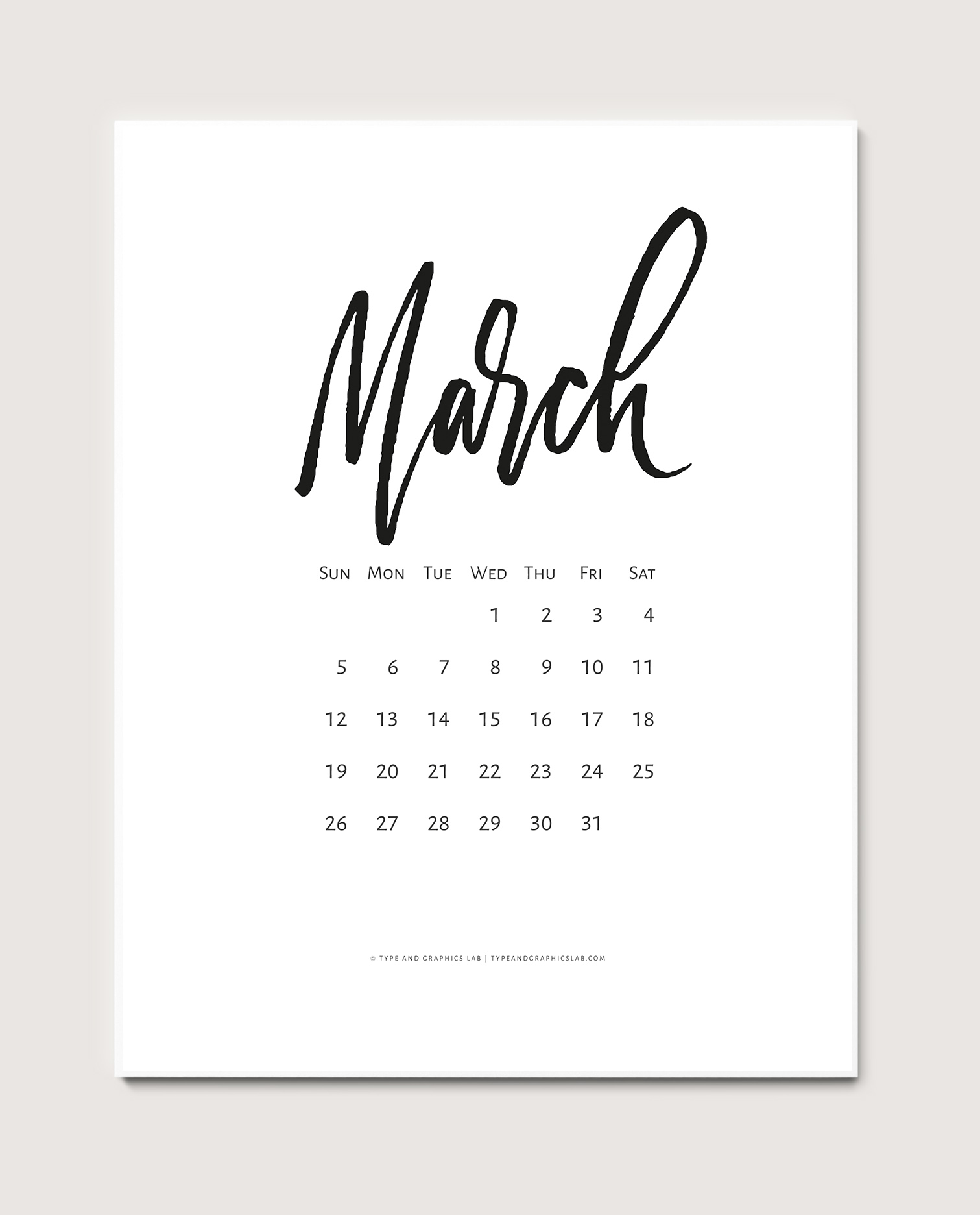
Free Calendar: March 2017
Download a free calendar for March 2017!

Desktop

Mobile

Printable

New in Portfolio: A Party without Cake is really just a Meeting
Oh boy, it took me a while to create a lettering piece inspired by Julia Child's quote, which I absolutely adore: “A party without cake is really just a meeting.”

Oh boy, it took me a while to create a lettering piece inspired by Julia Child's quote, which I absolutely adore: “A party without cake is really just a meeting.” The main challenge was to find a good place for the two articles before the words “party” and “meeting.” After trying different layouts and styles, I decided to keep them pretty clean and place them directly before the words. Such a layout creates a nice repetition which is reinforced by the similar swashes on the letter t (the word “party”) and the letter g (the “meeting”). Right now the final composition looks quite balanced, but I still want to keep some of my early sketches just in case I decide to come back and redraw the whole piece again in the future. Who knows, maybe after a while I’ll get some inspiration from those early ideas.


Here is the final work in color:
