100 Days of Lettering: Part 7
I’m back with a project update for the last ten days.

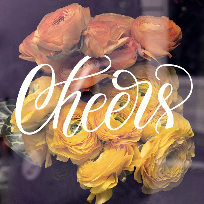
In the beginning of my lettering challenge I was trying as many techniques and as many media as possible: pencils, markers, brush pens, natural brushes, digital painting, etc. It was all very fun, although sometimes a little bit time consuming. I knew it wouldn’t be possible to have a lot of time to draw each day for all hundred days, so I was prepared that sometimes I would only have 10 minutes to accomplish my piece. What I found is that accessibility of your tools is the key to keep up with this challenge. It’s easy to work with brush pens or practice calligraphy, since it requires basically only one step: just open the ink container and you are ready to go. That’s easy. Brush pens usually don’t have to be cleaned at the end like, for example, natural brushes. And we all agree that washing brushes is much less fun than dipping them into paint. Most calligraphy nibs need a simple wiping with a wet tissue to be shiny and bright again. The easier are all the preparation and the finishing steps, the lesser is the resistance to start. This is a crucial requirement for a long term daily project. In my case it turns out that ink is my easy-to-go tool.


100 Days of Lettering: Part 6
Here is my #100daysoflettering update + few tips on getting started with your own daily lettering challenge.

I challenged myself with the #100daysoflettering because I strongly believe that quality comes with quantity. I remember very well the time when I've been working for a month on one particular vector lettering. It was quite a detailed piece and everyday I was trying to change something: add new colors, textures or even more details. I've made about 10 versions of that image, but nothing pleased me enough. Here I must say that it was my third attempt to create a vector lettering. At that time I was very naive to think that playing with shadows, colors, and other fancy stuff was the best way to improve that particular work. But it was wrong. Sticking with only one project for a long time is not good in the beginning. It's much better to work on quantity and gain experience then stress too much about the quality of your first attempts. Now I realize that I should have done several smaller projects during that month instead of spending a lot of time on improving one image. The reason I love my daily lettering project is that it keeps me in a flow. I almost became a lettering machine (it feels so). Even though I don't always have a lot of time to experiment with techniques and styles, I practice some kind of lettering everyday and this is the most valuable part of the whole challenge.

If you think about starting your own #manydaysoflettering challenge, here are few tips to consider:
1. Prepare the Phrases in advance.
Nothing is more distracting and time consuming than trying to find the right phrase to draw just before the practice. I’ve spent half an hour to find and write down about fifty phrases for my challenge. The rest of the list is filling on the go when I have a spark of inspiration.
2. Cite the author or use your own phrases.
When working with a specific quote, make sure to cite the author. Invent your own quotes or use some general motivational phrases like “Never give up” or “Smile more often.”
3. Keep it simple.
In the beginning I suggest creating a single word lettering, since it’s much more manageable. Drawing a long phrase can be overwhelming and discouraging, so keep everything simple.
4. Be realistic.
Don’t start a #milliondaysoflettering challenge. Chances are you will fail and will never try again. Your lettering project should be challenging but manageable. For the first time try it for a week, then a month and so on.
5. Keep your workspace ready.
I find it very useful to separate my digital and nondigital workspaces. Having a second table allowed me to keep all my tools ready to use. No space for a second table? No worries, just keep your tools at the most convenient place and as close to you as possible. And remember, it’s all about practice and not about fancy materials or a workspace. All you need is a piece of paper and a pencil.
5. Don’t stop.
Even if you missed a day, don’t stop the challenge. It’s easy to say “I failed, so I guess that’s all.” Consider a missing day as a micro fail, but not a reason to stop.
6. Consider mistakes as opportunities.
Never blame yourself for any mistake. Learn from them and play around. Recently I smashed a pencil sketch with my hand. It was a little bit disappointing, but I decided to turn that spoiled page into a cool blurry background and pretend that the texture was intended. The whole piece was pretty good at the end! Some mistakes can lead you to new interesting things, so keep practicing.


100 Days of Lettering: Part 5
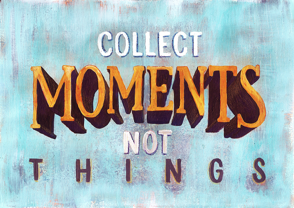
The most interesting experiment over the last ten days was the painting “Collect Moments Not Things.” I found this phrase few months ago and kept it in mind to illustrate one day. Then my lettering project came out, so I decided it was a perfect chance to create this piece. After trying different layouts I ended up with the one below. At first I planned to make this work 100% digital, but I didn't get enough vivid look by applying different colors and textures. At some point I decided to play with acrylic paints. After all, why not? Although the whole experiment was fun, I’ve made a biggest mistake by using a small piece of paper (about 9 in x 12 in). Painting tiny letters was much harder than I expected, so all my lines were a little bit shaky. Nevertheless I am quite happy with the textured background and all those colorful layers appearing through one another. Well, I've learned my lesson, so the next time I decide to paint a lettering piece, I will definitely use a much bigger canvas.


100 Days of Lettering: Part 4

Here is my quick project update for the last ten days. Beside the calligraphy and brush lettering practice, I tried a full page of lettering without initial sketch for the first time. It was done with pens, so I was not able to make any corrections. Dealing with space issues on the go was really hard and the whole experiment was quite uncomfortable for me. Nevertheless in the middle of the page I found some kind of flow and enjoyed the process without judging the result. Trying new things is always scary, but it expands the comfort zone and, therefore, is good.


100 Days of Lettering: Part 3
This morning I discovered the whole new world of the digital painting while making the piece below. I enjoyed the process of adding shadows and textures to get this retro feeling. The letters seem to be made of wood and remind me street signs.

All letters are custom made (no fonts used).
Other days I was experimenting a lot with Faber-Castell Pitt Artist pens. These pens have a rigid brush end, which gives a consistent line thickness and is quite easy to control. The textured effect greatly depends on the writing speed. As soon as you make a pause on the paper, you will see a dark spot of ink. To get a dramatic effect of disappearing lines you need to write really quickly.


This piece was made with a natural brush.

100 Days of Lettering: Part 2
Here is the second part of my 100 Days of Lettering challenge. During the last ten days I played with brush pen, drew some doodles and made few calligraphic pieces. I also found two interesting effects discussed below.


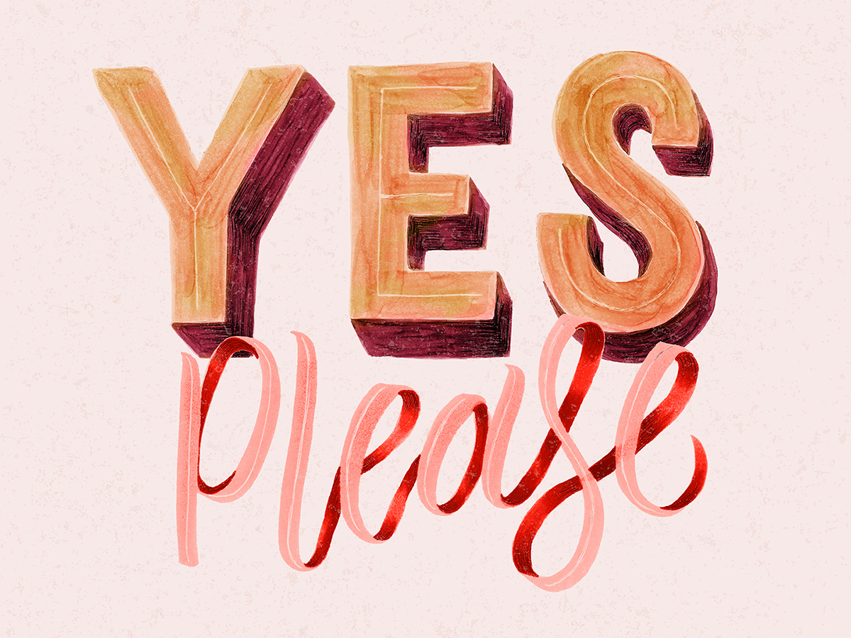
1. Copic markers create textures similar to gouache.
The “Yes Please” piece was made with two green Copic markers (like “Focus” above) and recolored in Photoshop. I found that the textures and shadows that I got from markers are very close to watercolor and gouache.
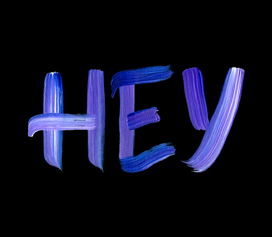
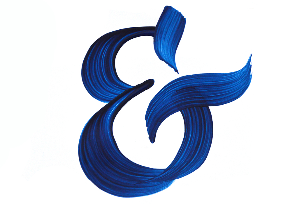
2. Glossy paper + acrylic paint = vivid brush strokes.
The blue ampersand below was a happy accident. I decided to use the glossy cover from the album pad and try a blue acrylic paint on it. The result amazed me: since the paper was super smooth and bright, all my brush strokes became visible. I didn't expect to get such a vivid look. With a black acrylic paint, the result is usually more muddy. But the blue color allows you to achieve diverse range of shades: from dark to almost transparent. How to get everything in one stroke? Try a glossy paper.

100 Days of Lettering: Part 1
Here is my project update for the last week (days 3–10). I am cheating a little bit, since I don't show up on Instagram daily, but I am showing up to practice and experiment. Uploading work online takes a lot of time that can be spent working. So I hope that you forgive me for being inconsistent with my online presence. The blog posts will arrive every ten days though, as it was planned.