


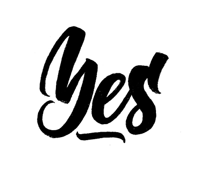
Product Update: Summer Collection
Ten new sea life patterns.

Recently I released a new version of my Summer Collection. Initially it contained 27 patterns with anchors, cocktails, different fruits and palm leaves. Here are few of them:

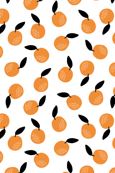


While spending this summer in the city, I realized that the real summer for me was always about going to the seaside. Evidently, my collection missed a core element of the summer: the sea life. So I started working on this topic and eventually created ten more patterns with fish, shells and corals. All patterns come in black and white, but you can play with color in Adobe Illustrator or Photoshop. I’m quite happy with this update for the moment. However if I have a sudden hit of inspiration from the hot weather, I might update it again in the future. Stay tuned!


P.S. All updates are free for everyone who has already purchased Summer Collection on Creative Market ;)

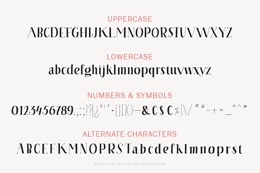
Soleil | A Serif Font
I am really glad to introduce my recent serif font Soleil.

The font name comes from the french word “soleil,” meaning “sun.” All letters were drawn by hand, carefully digitized to keep that slightly rough look, and then turned into a playful serif font. Soleil supports most European languages and comes with upper- and lowercase characters, punctuation, numerals, and symbols. This font is suitable for package design, branding, logotypes, print or digital ads, and many more.


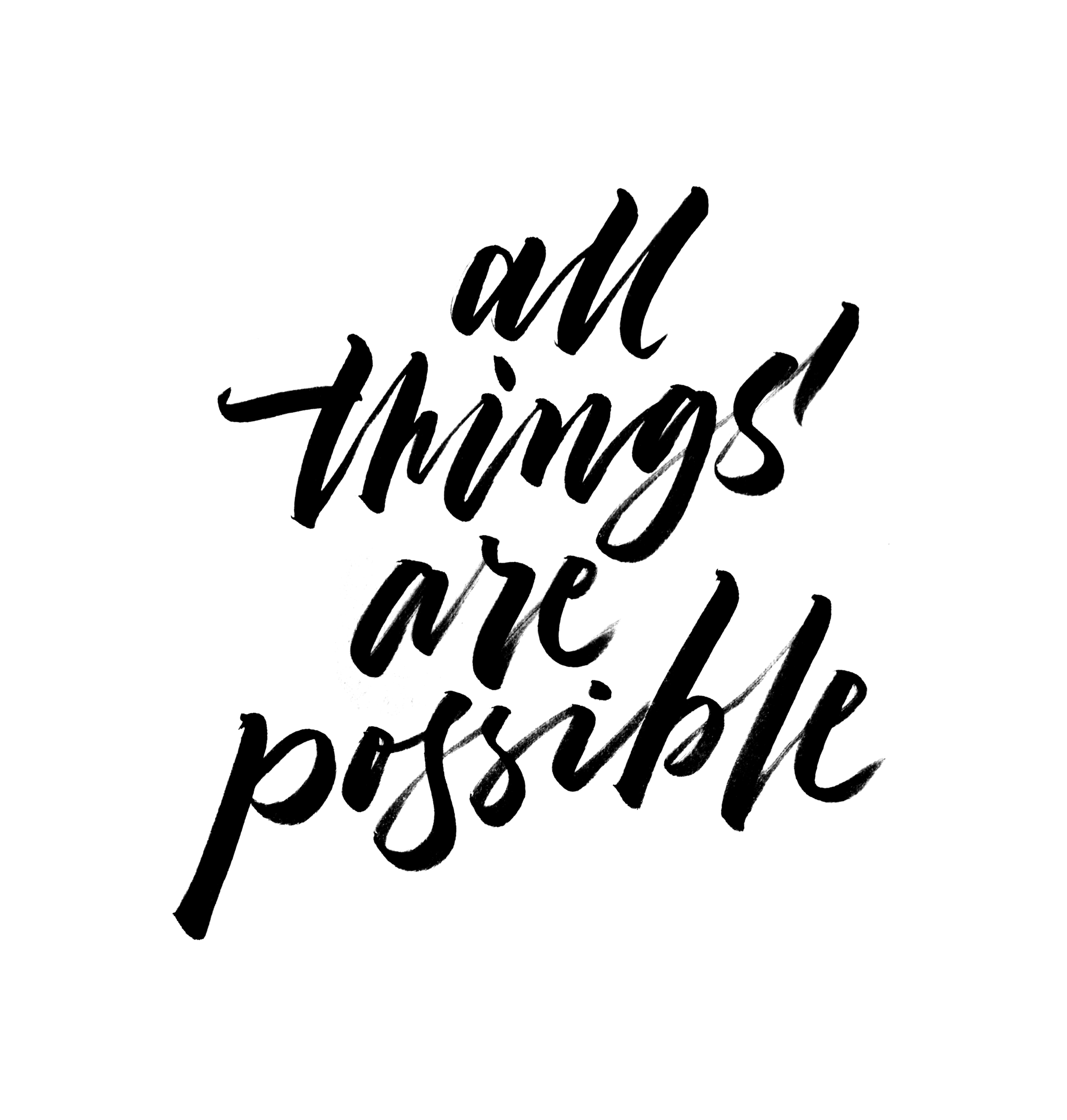
100 Days of Lettering: Part 10
The last part of the lettering challenge. Finally!

I can’t believe that today is the last day of my lettering project. In the middle of the challenge I had an impression that it would never end. Looking back now I realize that it was actually very fast and even not enough to find my favorite style, technique or media. Drawing letters for 3+ months is almost nothing if you think about your whole life. It’s like a tiny little step towards new adventures and discoveries. The good thing is that the end of the project is not the end at all, but rather a beginning. I will try to maintain my habit of drawing letters every day and post new projects as often as possible. Now I'm going to make myself a cup of coffee and enjoy the moment of glory ;)
Thanks for watching!


Other parts:


100 Days of Lettering: Part 9
Rediscovering pencils.

One of the best things that happened during my lettering challenge is that I started drawing a lot with pencils. For a long time, I avoided using this basic tool and preferred working with ink instead. The idea of smashing a pencil sketch with my hand and ruin the whole piece always terrified me. When it comes to working with ink, I pay much more attention to keeping my hands out of the freshly painted area. Most of the time my hand and the ink do not interfere, so there is no mess. Working with pencils was more challenging. I had to be careful with my hands when going back and forth over the drawing. Recently I found a few tricks that help me to keep the pencil sketches clean:
1. Go from light to dark.
I usually start my sketch with a hard pencil such as F or HB, which gives a light line. It allows me to work all over my sketch without any fear to make it messy with my hand. Also, light sketches are easy to correct with an eraser.
2. Use a protective layer of paper.
Sometimes I put a piece of paper on top of the pencil sketch to protect it from my hand movements. This trick works pretty well, although it demands an extra attention each time when moving the protective layer of paper to cover a new area of the sketch. I always check the paper’s “down” side that was in contact with my drawing to make sure it has no traces of pencil. If it’s dirty, I use a new clean piece of paper.
3. Redraw the final work.
Nothing works better than redrawing the final work. When all the details are placed in place, I put a new piece of paper over my sketch and redraw everything. This process is clean since I move my hand from top left to bottom right of my drawing without going back and forth.
That’s all for today. If you have other tips and tricks on how to keep a pencil drawing clean, I would be glad to hear them from you. Also stay tuned for the last part of my lettering project!


100 Days of Lettering: Part 8
During the last ten days I spent a good amount of time working on a single piece — “Eighty percent of success is showing up.”

I immediately fell in love with this quote by Woody Allen, since it sounds like a perfect motivational poster for any creative person. It took me approximately 10 hours to finish this piece from the first sketch to the final vector work. I still see few places where I would add more details, but for the purpose of this project I will keep it as it is for the moment. The rest of the work is the usual brush lettering.


Russian word “Dream” | typeandgraphicslab.com


Caffè Latte
I'm glad to introduce my new marker font “Caffè Latte.”

Caffè Latte is a hand drawn marker font with a playful and fresh look. It comes with capital and lowercase characters, punctuation, numerals and symbols. International characters are represented on a preview. As a display typeface Caffè Latte is suitable for branding, logotypes, print and digital ads, social media marketing, posters, and many more. Check out the previews for inspiration!


